
Spoiler… The next version of Web $en$e will be all about the builder.
It wasn’t long ago that we announced the all new Web $en$e at the 2014 IDeACOM conference. We saw many improvements over the last version with an all new builder, an all new control panel and plenty more amazing tools to give you the flexibility to build an amazing web site. The builder itself was leaps and bounds better and came with several different modules that allowed you to drag and drop elements in place on your pages… It was pure bliss and we’ve seen some amazing sites built with the current version of Web $en$e.
The next step in our conquest to rule the universe is to re-imagine the page builder with more flexibility than ever before. But hold on a minute… before we get started, I have to warn you… all the features you see here are “Possible Features”. They may or may not make it into the final version. Only time will tell what actually makes the cut, but what I can tell you is that whatever does make it into the final version will be nothing short of amazing.
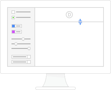
Global settings
The new version will get a set of global settings that will help you with site wide customizations. Things like the height of the navigation menu, the size of the logo, and the size of the content area. This version is all about making your site more customizable and adaptable.
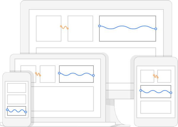
Fluid grid
The grid will be completely re-coded and built to be entirely fluid and percentage based. Currently, Web $en$e sites are a fixed width. Sure, the width changes depending on what size screen you are using, but no matter what screen size you have, the content width is fixed.
This works great at the moment, but the end game is to give all fixed widths the boot along with the time consuming effort it takes to modify them. The end result will be a fluid interface that looks the same on your desktop, but responds in a much more intuitive way on mobile devices. It’s this fluid grid that will allow more customizations than ever before.
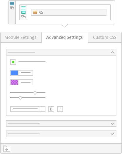
Advanced builder settings
As I mentioned above, the grid will be fluid, but that’s not all… It will be flexible too. And when I say flexible… I mean, like a yoga instructor. Advanced design settings will be added to every single module that allow you to quickly edit every aspect of each module without any coding whatsoever. We’re talking custom colors, fonts sizes, padding, margin, and more. It’s like a CSS editor, but friendly and intuitive.
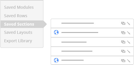
You’ll be able to save more than just layouts
Currently, you can save your layouts and easily re-apply them with a single click. This is a great feature that gives you the ability to create multiple page templates, then apply them to any page instantly. Well… in the new version, you can do even more. In addition to saving full page layouts, you’ll now have the ability to save individual modules, rows and sections. This new feature will make creating new pages so fast, you’ll wonder how you ever did without it.
But wait… there’s even more
There are even more features planned for this new release, but unfortunately… I can’t give everything away. What I can tell you is that if you are on the current version of Web $en$e, you’ll get the upgrade along with all these shiny new features, free of charge.
So, if you are on the fence about going with Web $en$e or you are waiting to see if a new version comes out, I say why wait. You’ll get the new version when it comes out anyway.